Old Designs
Unlike many websites, Sulake have had to develop the Habbo website layout many times over the years due to the numerous amounts of Updates. The most memorable feature of the old designs was the orange and blue colour scheme, (which used to be black and grey). Many Habbos remember a time before the Me Page as it was only first implemented in 2007, before that users logged in directly on the client.
Here are all the old designs and the different changes each of them presented:
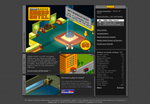
February 2001 (August 2000 for Habbo Hotel Finland)
This layout was quite plain, and it had a fairly dull black and grey colour scheme. Nevertheless, it still provided the information that was required and some other trivial items (such as the number of users in guest rooms). It also displayed the amount of people online, the latest news and pieces of information (such as the TOS).
Also, you can see in the top right corner (by looking at the image at the bottom of this page) that the Newsletter was around since 2001.
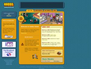
June 2003
This is where the famous orange and blue colour scheme first makes an appearance on Habbo. Visually, the homepage looked a lot more appealing and brighter than the design from 2001 and there was also a bit more information placed onto this design (such as the new "Shop" tab). It was also much easier to view the latest events and news. This layout is probably referred to as the simplest and most attractive design due to navigation being incredibly easy.
Also, advertisements first started making their appearance in this layout!
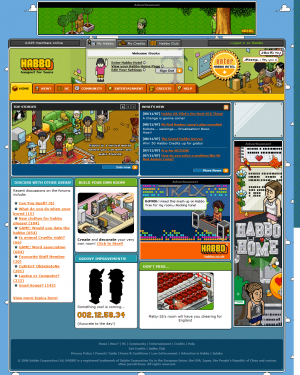
May 2006
During this update, Sulake decided to emphasise upon modules, images and colour on the homepage. The homepage certainly became a lot more appealing to the eye and much more interactive for users. There was a lot more advertisements regarding Habbo features and latest events/news articles. You could also now view the latest forum posts on the homepage and the community tab - a feature which was later removed from the homepage.
However, although this homepage looked quite bright and colourful, many users disliked it due to the complexity of navigating around the site. There were so many modules and tabs meaning you could easily get lost around a gigantic website. Hence why Sulake created a new layout quite quickly.
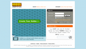
December 2007
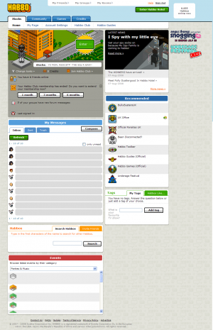
This particular design had moved away from the traditional 'blue and orange' colours which has symbolised Habbo for quite a few years. This new design also meant that you now had to log in (via a "landing page) before being able to access the site, rather than logging in directly on the client.
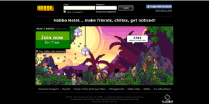
The landing page had quite a few interesting features, such as a tag cloud and a display of the number of log-ins over the past 30 days. At this point in time, you could still log in via your username.
As for the "/me" page. It looked quite plain as opposed to older designs and it became incredibly long (in terms of height) due to so many modules being added/altered. Also, a new information box was added below a user's avatar. This displayed a variety of items, such as the number of HC days you had left, how many credits you had in your purse, your online friends and so on. This design remained unchanged for quite a long time.
2010
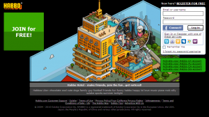
Not much changed during this design, but a brand new log in page did appear! This time, Sulake decided to try out a green and black colour scheme on the log in page with a hotel view image being the background. The tag cloud was also moved to the bottom during this update. Also, you could now log in or register via a variety of 3rd party services (such as Google and Facebook). During a later update, the log in box was moved from the right to the top of the page.
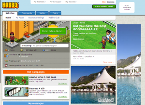
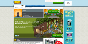
The "/me" page didn't change much. A few modules were replaced with more interesting ones - "Hot Campaigns" and "Staff Picks". More advertisements were also added onto the "/me" page.
2011
The only difference on the "/me" page during this design, was the alteration of the link "Habbo Club" to "Habbo Club/VIP". It was altered again later to just be "VIP" after the removal of Habbo Club.
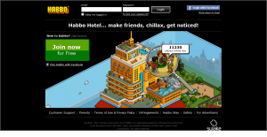
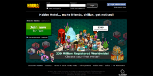
As for the landing page, it changed quite a lot. You could no log in via your username (you had to use your E-mail) and the log in box was moved to the top of the page and centred. The Facebook log in method now appeared in a pop up box as opposed to the old redirect link. The number of services you could sign in with also expanded. Sulake removed the 'Habbo Likes:' part of the login page and replaced it with a few links - "Customer Support, Parents, Terms of Use & Privacy Policy, Infringements, Habbo Way, Safety, For Advertisers". Sulake also added their logo at the bottom right hand corner of the page.
A new background image was also added to the landing page!
9th September 2011
This time, Habbo purely focused on the new background design. The background became an image full of Habbos mixing with each other and focusing on the fact that you can meet friends on Habbo - as well as the "230 Million Registered WorldWide" part. The only fault with this landing page image, is the fact that the "Join now" box doesn't seem to fit in with the colour scheme at all.
Also, some people saw alternative background colours for this image (blue and teal) for a few days. This may have just been an experiment by Sulake, but nevertheless the alternative colours did look appealing.
February - March 2012
The landing page only received a minor update during this period, the image became more Valentine's Day themed - yet it still hasn't been changed 3 months on.
As for the "/me" page, the plain background remained but a large amount of modules were removed from the page. The only modules that are now on there are the newsreel, a Twitter feed and a mini information module about your user. However, you could no longer edit your motto via the homepage nor could you see who your online friends were. Mini-mail also became available from the client only and news was now only displayed in 1 or 2 paragraphs. "Submit an idea" and "Report a bug" buttons were added to the top of the page later.
The only thing that was unaffected was the number of advertisements on the page.
Images
